Site Redesign
Streamlining a busy public library site
I partnered with another designer to redesign the Southern Lehigh Public Library's site. Our goal was to not only modernize the site's look and feel. But also streamline the information architecture and structure to better match users’ expectations.
Site Inventory
We started by taking inventory of the current site. We identified two tasks that likely draw a lot of site visits:
1. Signing up for an event
2. Registering for a library card
We pinpointed 20+ usability issues in those flows.

Common themes included excess or repetitive info and lack of continuity throughout the site.

Failed color contrast ratios for WCAG AA

Chaotic and inconsistent look and feel

Library card request links out to a new site
User Interviews
We interviewed four participants to dig further into those usability issues. The participants confirmed some of the issues we identified – like the chaotic look and feel. They also identified some misleading content.

“It doesn’t say "sign up" anywhere. ... It’s very bad.”

“The "My First Library Card" name was misleading.”

“Couldn’t figure out how to register for an event.”

“It’s just a lot of copy and not enough white space.”
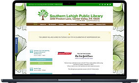
Site Map
In order to redesign the site in a cohesive way that addressed the usability issues we identified, we mapped out the existing site. This gave us a birds-eye view of how the site is organized.

Card Sort
To ensure the redesigned site was organized in a way that matched our users' mental models, we conducted an open card sort with 3 participants.


The before and after videos not only show a streamlined number of pages and menu items. The after menu is named and structured in a way that reflects participant feedback.
Before


After

Mood board
The library’s earthy brand colors match their logo. Which is a tree sprouting out of an open book – symbolizing personal growth.
For brand recognition, we retained semblances of that branding. Filtered through the lens of trend-forward coffee shops, bakeries and book store brands.

Brand Positioning Statement
We applied user test results and knowledge of the site to ground our efforts in a brand positioning statement:
At the Southern Lehigh Public Library, we provide resources to foster community involvement and education. Our goal is to help residents engage in lifelong learning, feel connected and meet their recreational needs.
Wireframes
With our user feedback, mood board exploration and competitive analysis in mind, we realized it’s important to users that we surface the following tasks.
-
Searching the library catalog and site
-
Registering for a library card
-
Signing up for library events
We tested two different ways to showcase those items on the homepage:
Version A

-
Uses a radio button to filter the search
-
Features stock images
-
Search bar showcased in the hero space
-
Displays one event at a time in the carousel
Version B

-
Uses tabs to filter the search
-
Features images from library’s Facebook page
-
Event showcased in hero space
-
Displays multiple events at a time
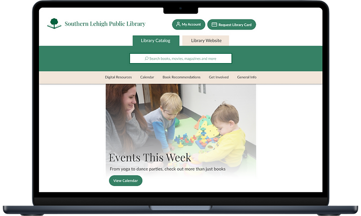
We ran usability tests with 3 participants. They preferred the human elements in version B. We implemented a few optimizations in the hi-fi prototype based on their feedback.
High-Fidelity Prototypes
Next, we developed a hi-fi prototype based on our style guide. We conducted a usability test on the first version with 5 participants. Suggestions focused on content updates to provide further clarity.
Our major update happened on the mobile-specific version.
Users felt the card icon wasn’t enough of a universal symbol for a library card.

So, to free up real estate we included it, along with a label, in the hamburger menu.

Current Prototype
I continued to refine the prototype adding more animations interactions to show the functionality of the site as we intended.

